Our Home

The Best Neutral Paint Colors for Your Home

Starting the process of designing and remodeling a space in your home is fun and exciting. But it can also be overwhelming, especially when you’re deciding on paint colors. We recently did a remodel to most of our house, and had to make lots of decisions when it came to paint. Today I’m sharing my favorite paint colors, and hope it helps you narrow down your search for the best neutral paint colors for your home.

Neutral Paint Colors for Your Home

It’s usually the same story. You’re standing in front of the gigantic wall of paint swatches at your local paint store, and it feels like there’s no less than one million options. You’re usually having a full blown conversation with yourself in your head. Will this look different in the light in my home? Is this too dark or too light? And your thoughts just go around and around. I wanted to share my best tips for choosing paint, and I’ll also break down each color I used throughout most of my home. 

SHOP THE PHOTO

Tips for Choosing a Paint Color

One of the biggest tips I give someone is to always, always get a paint sample for a color or colors you’re thinking about. Then paint a swatch on the wall of the room to see how it looks in the lighting in the day and night. If there’s not a small sample jar you can take home to use, then I’d suggest getting a paper swatch and tape it on your wall. 

You also want to consider your decor you’re incorporating into the room. Will that paint color match? Using a very neutral color like a shade of white, gray or taupe are all pretty safe to stick with. The great thing about using a neutral color like these is you can change out your decor over the seasons and years, and the paint color will usually go with most any decor you use. Neutral colors allow you to get longevity out of your paint, so you don’t have to paint every time you redecorate. That saves you time and money. 🙂 

SHOP THE PHOTO

Paint Colors I Used Throughout My Home
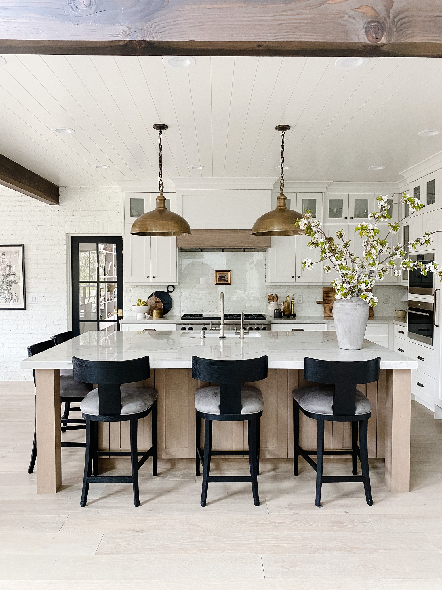
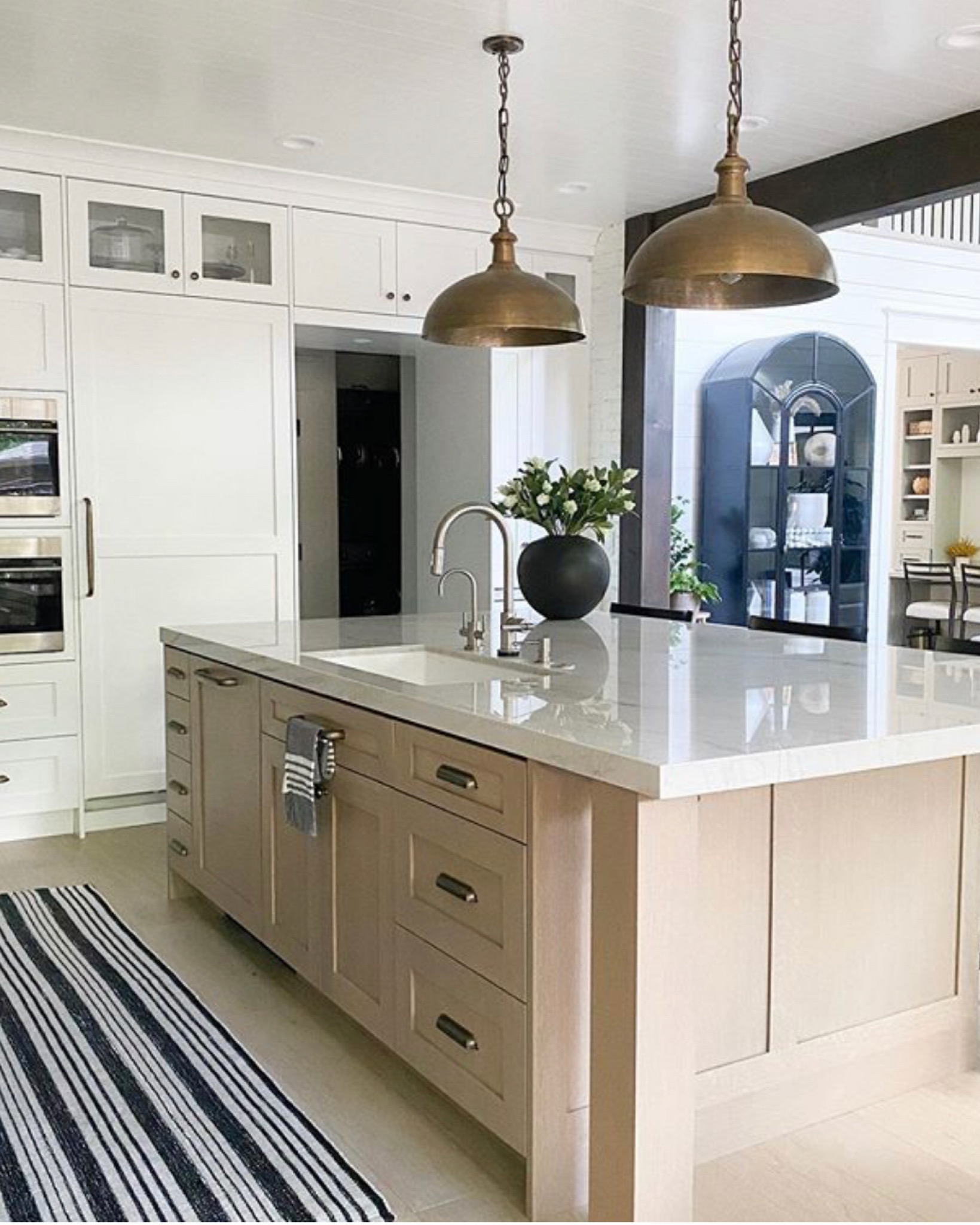
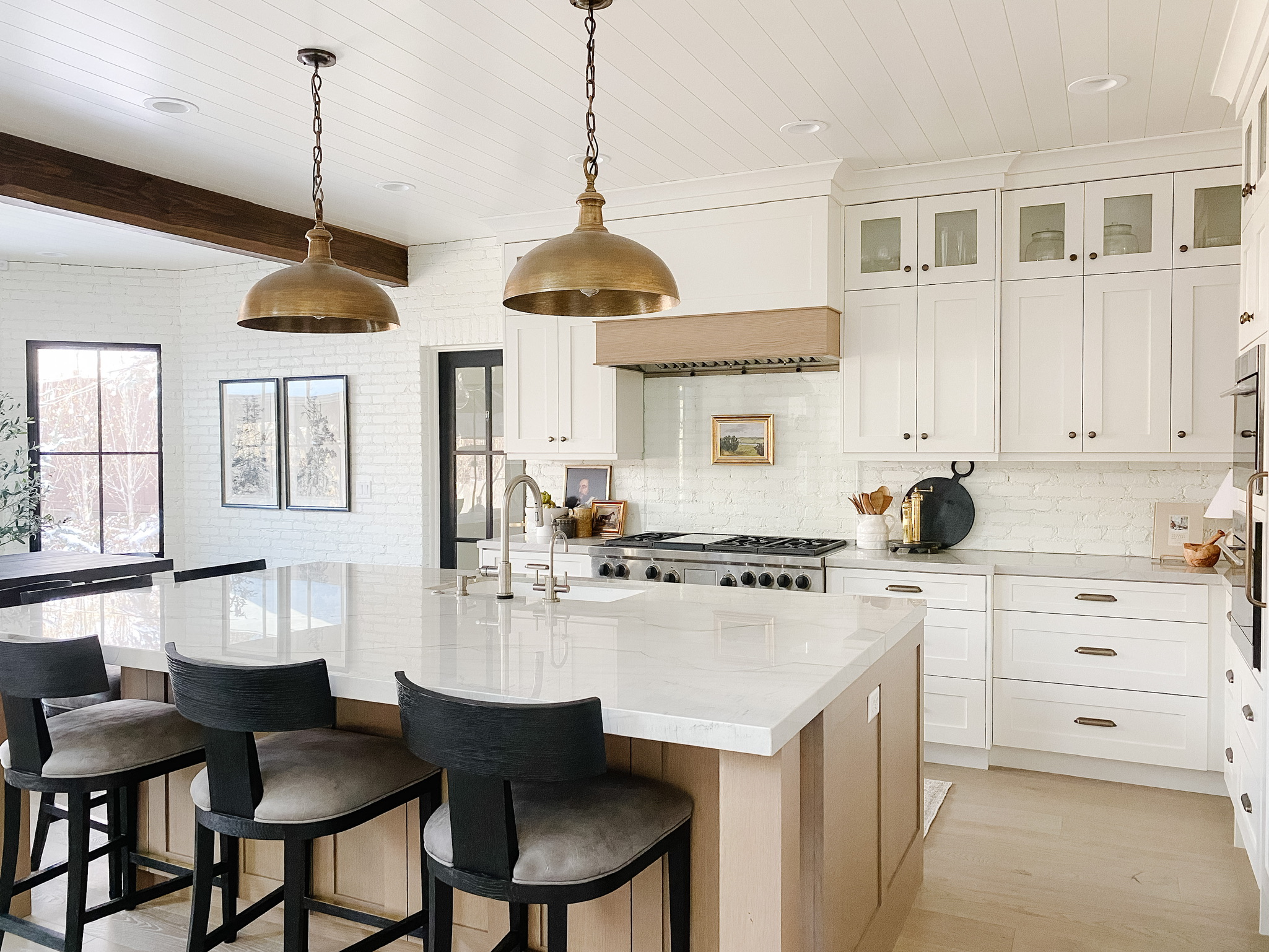
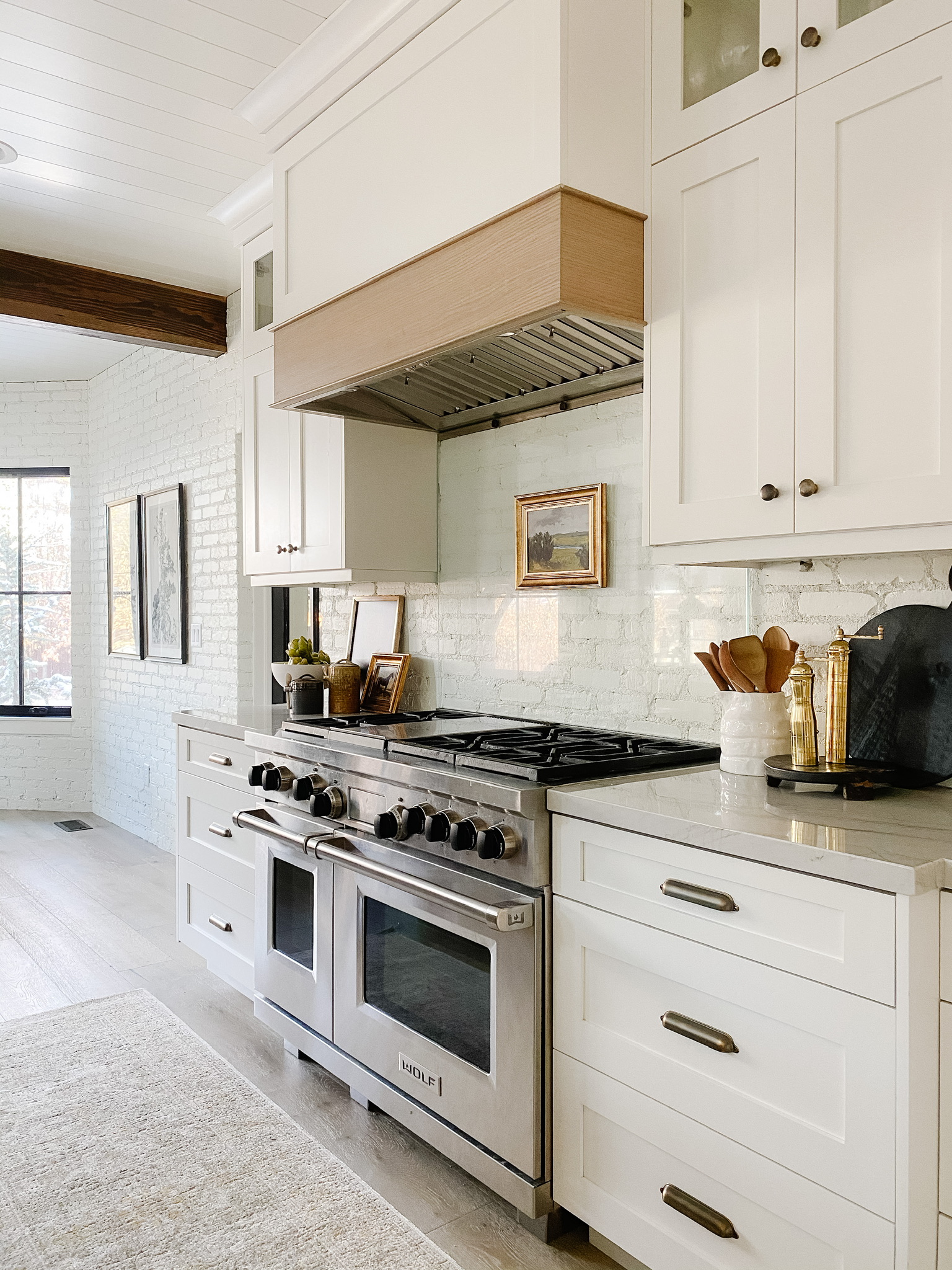
Main Floor

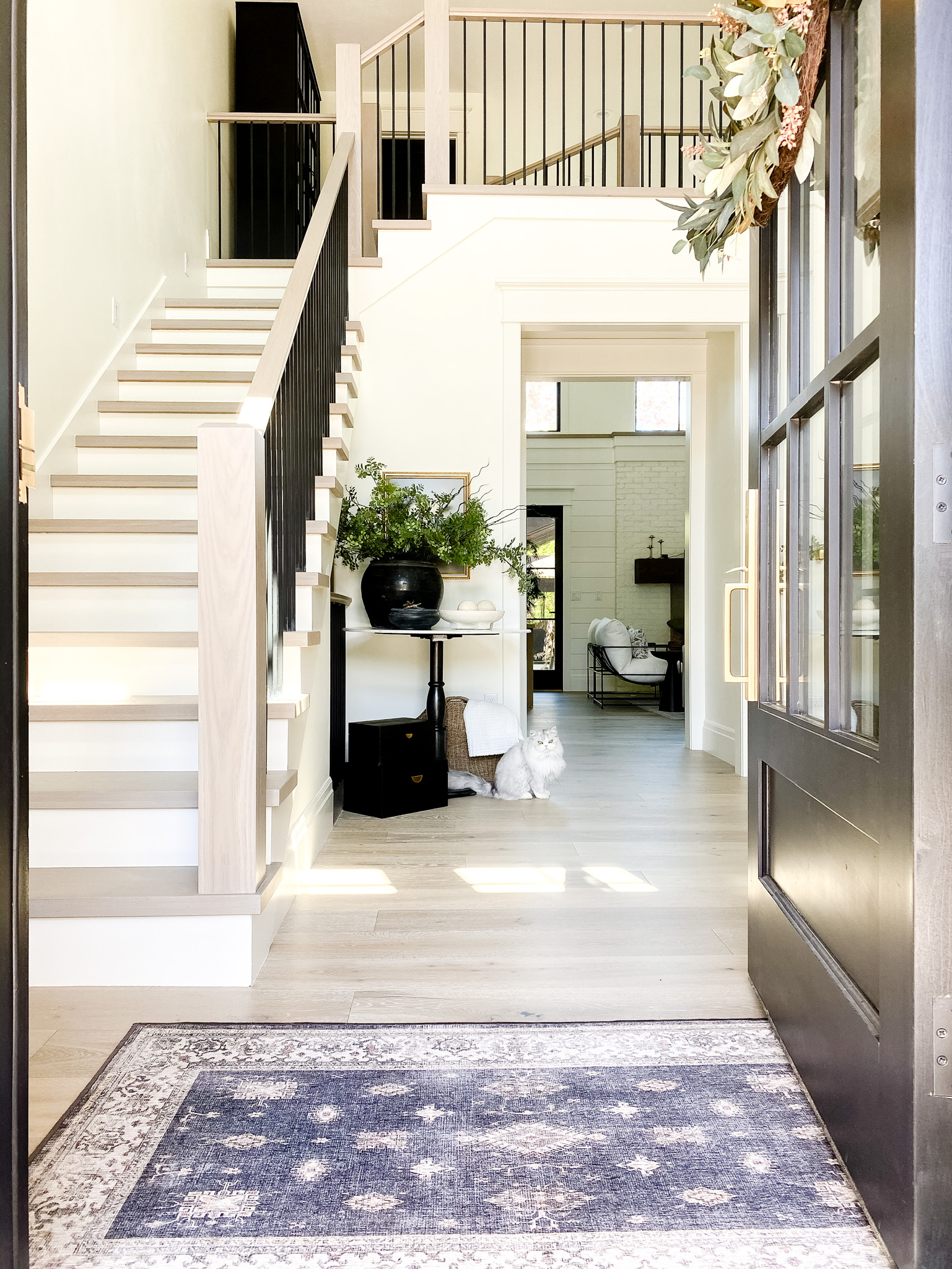
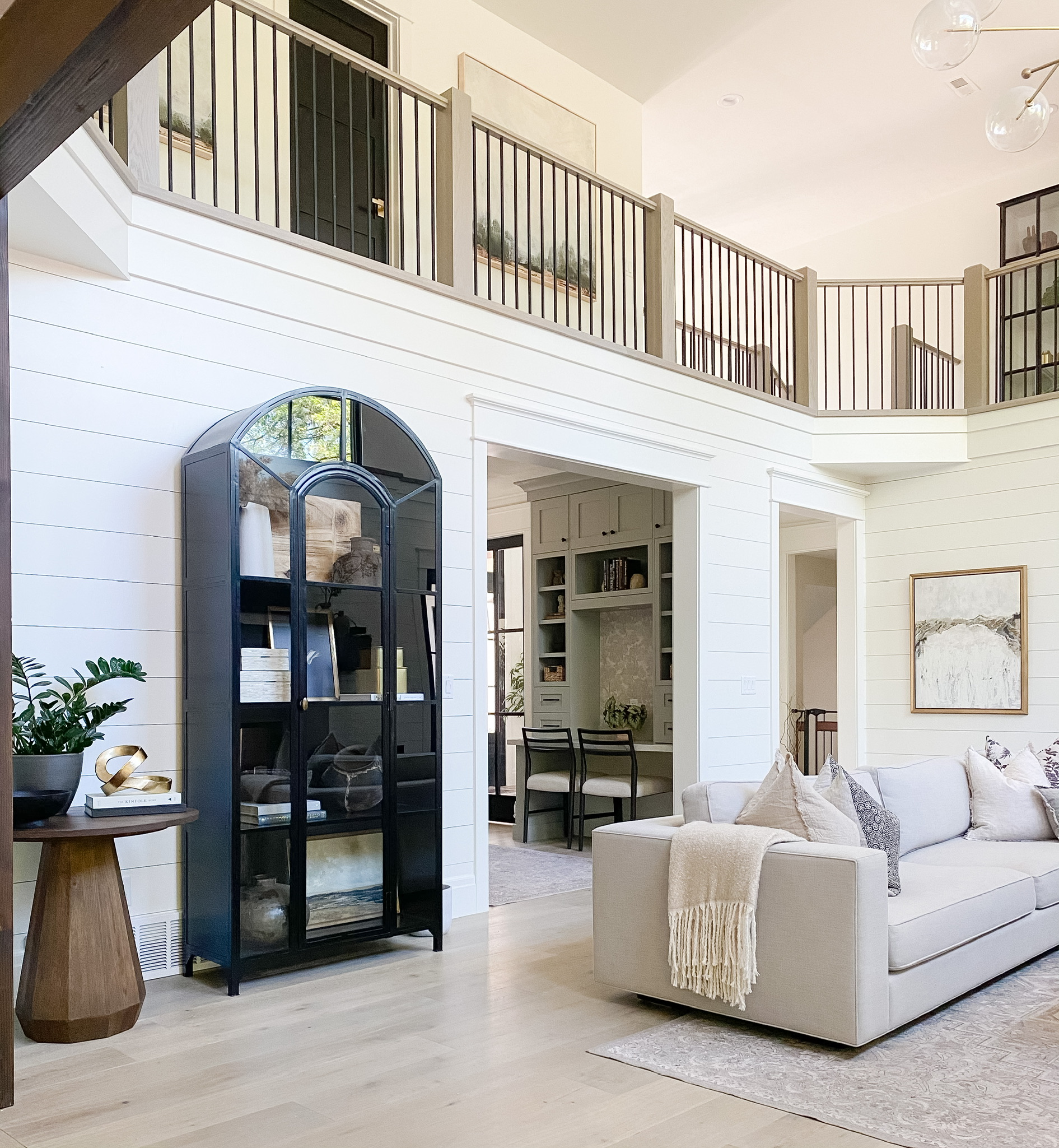
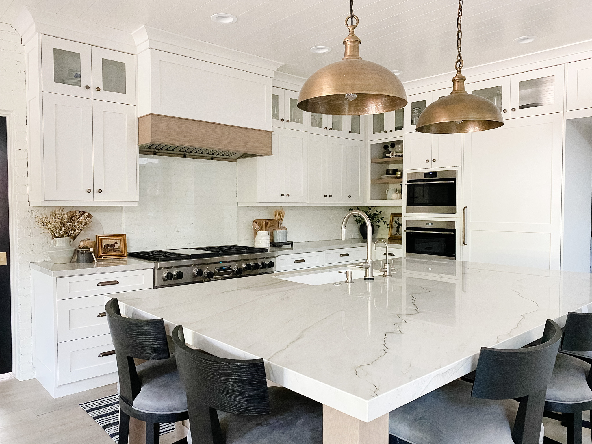
For our main floor, I used Benjamin Moore Simply White. This is a very popular shade of white. Benjamin Moore’s website says this color is great for walls, trim and ceilings, and we ended up painting all of those things in our home Simply White. However, we did do different sheens. Flat is on the ceiling, eggshell is on the walls and trim and satin is on the doors and shiplap. 

My Office

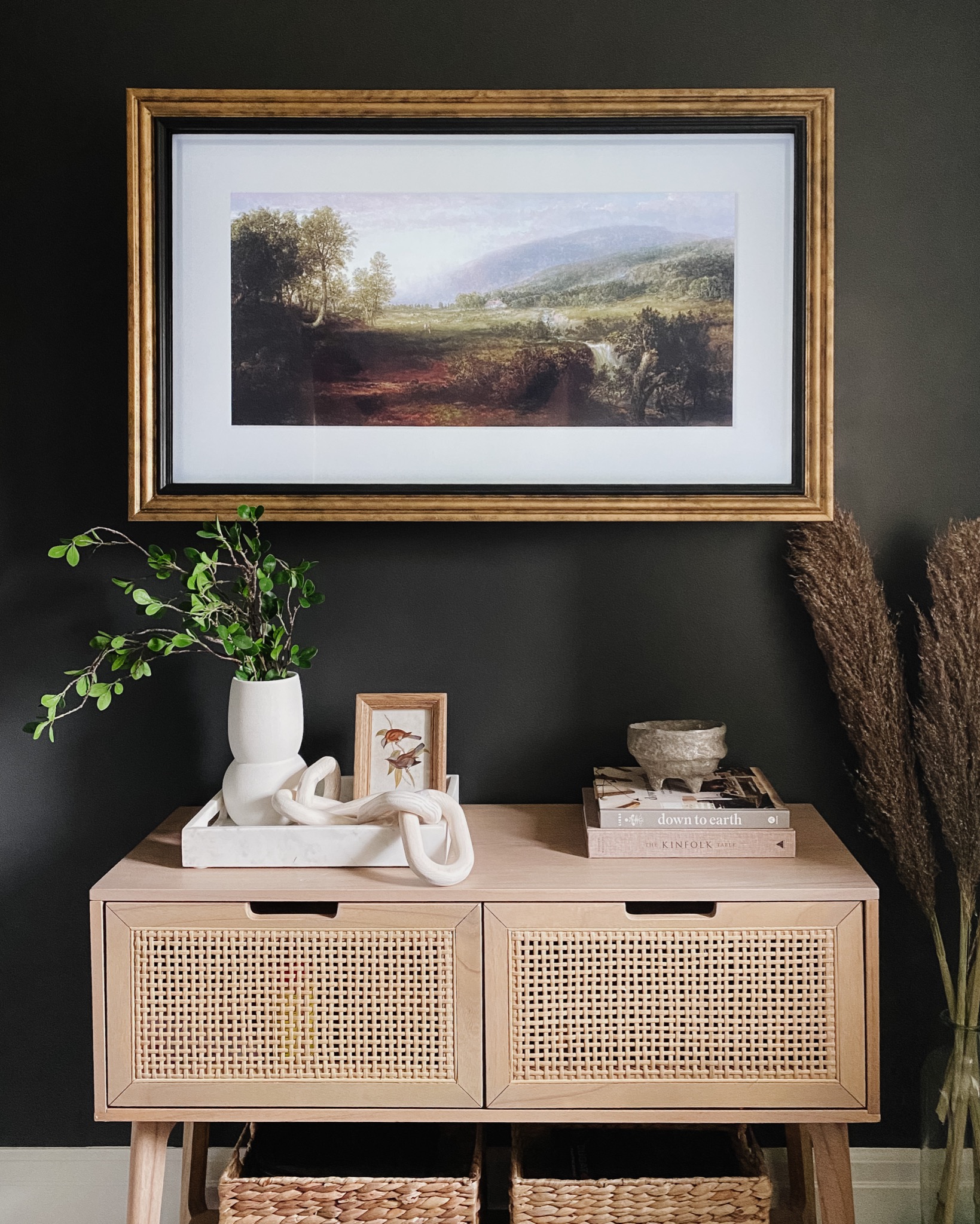
My office is painted Benjamin Moore Simply White on three the walls, and the accent wall is painted Sherwin Williams Iron Ore. It’s a softer black, almost like a smokey gray.
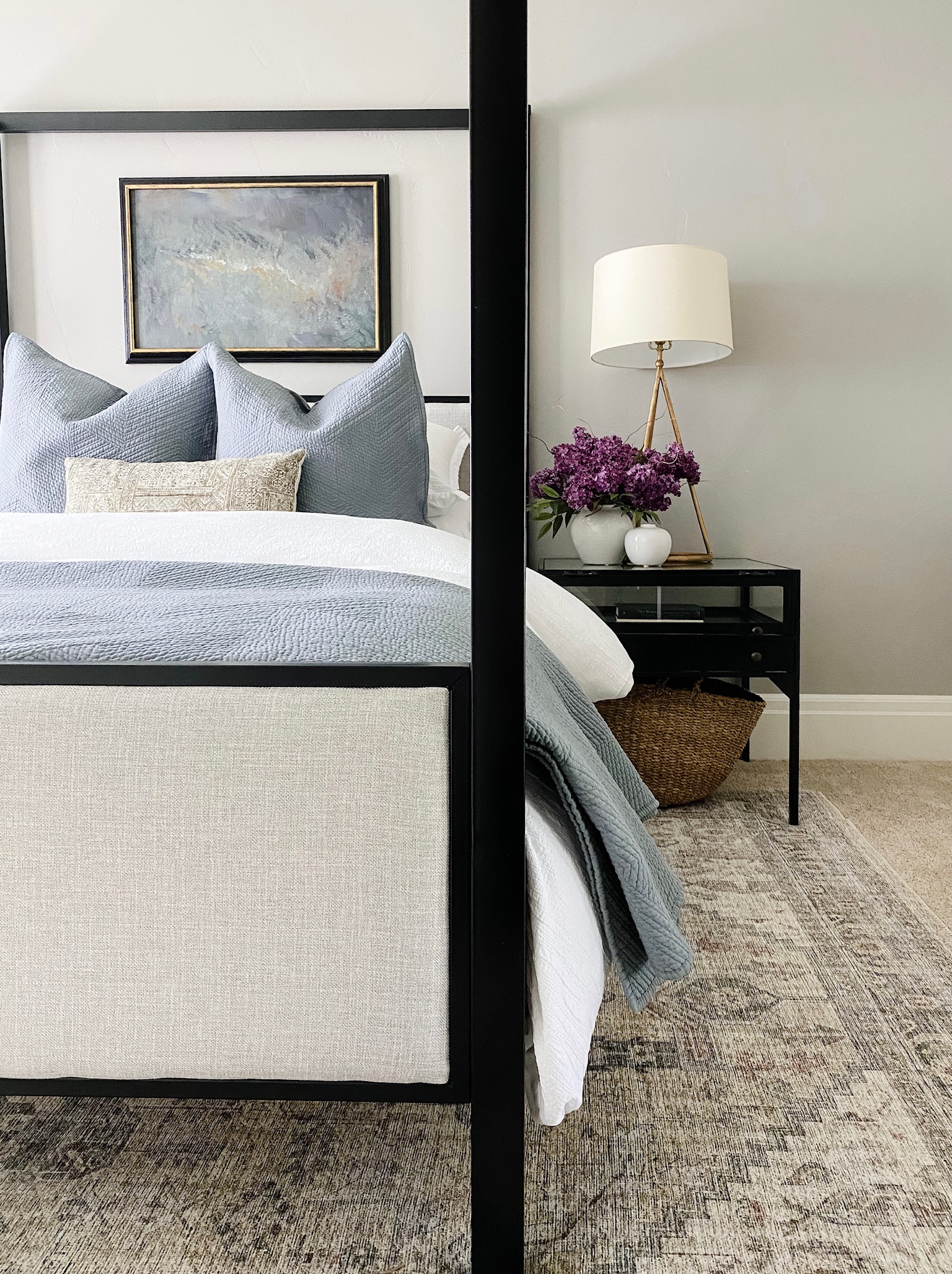
SHOP THE PHOTO

SHOP THE PHOTO

Guest Room

Our guest room is Sherwin Williams Requisite Gray. This color is a warm gray, which is sometimes lovingly referred to as a greige. Sometimes gray can come out too light and cold-looking. Requisite Gray has some warm undertones. When it’s painted on a wall, it looks like a clean, fresh gray. 
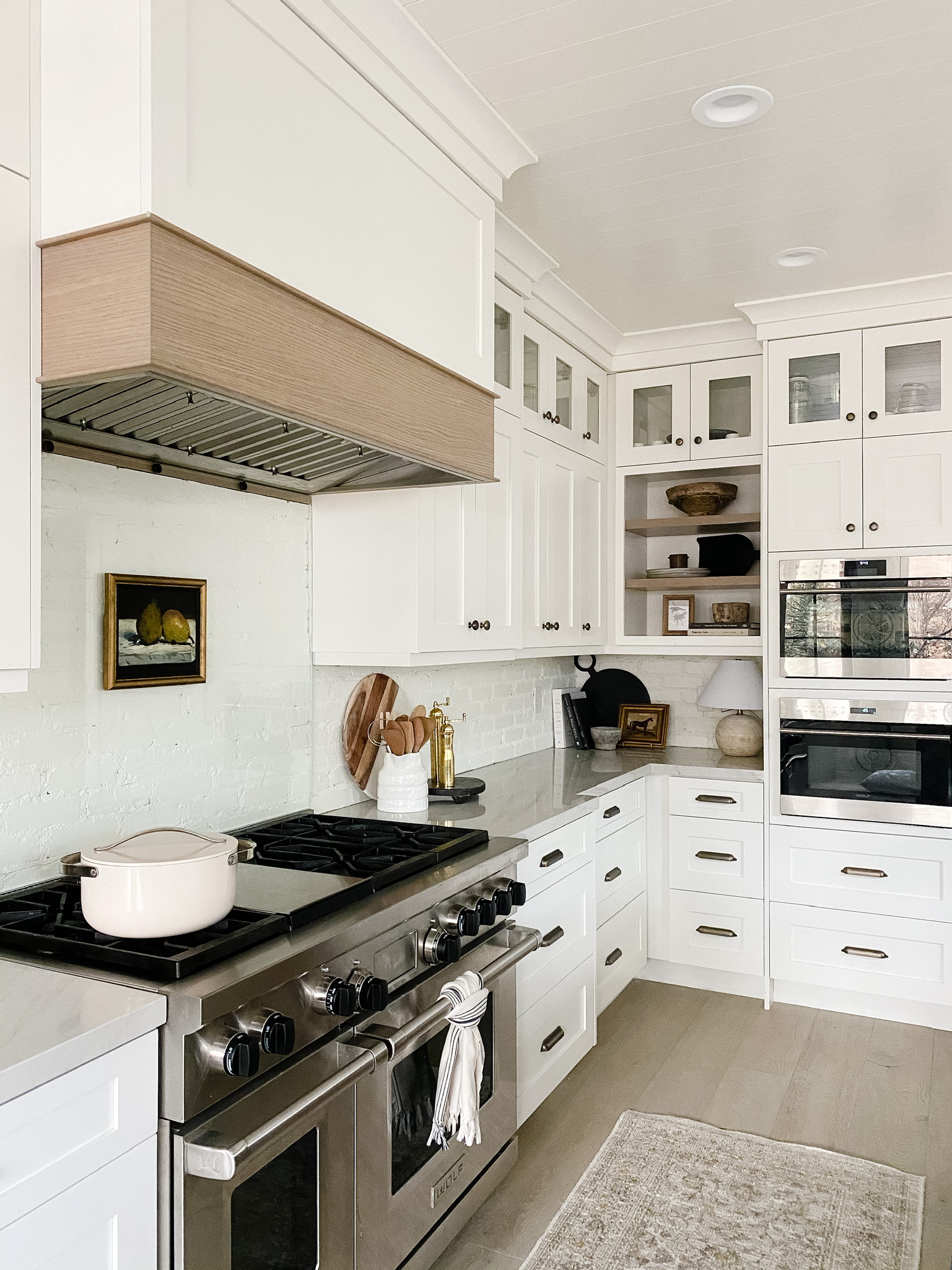
SHOP THE PHOTO

Kitchen

Four our kitchen desk area and office built-ins, we chose Sherwin Williams Dorian Gray. This is another warmer gray, but it’s a deeper shade than the Requisite Gray. 

The Best Neutral Paint Colors for Your Home

SHOP THE PHOTO

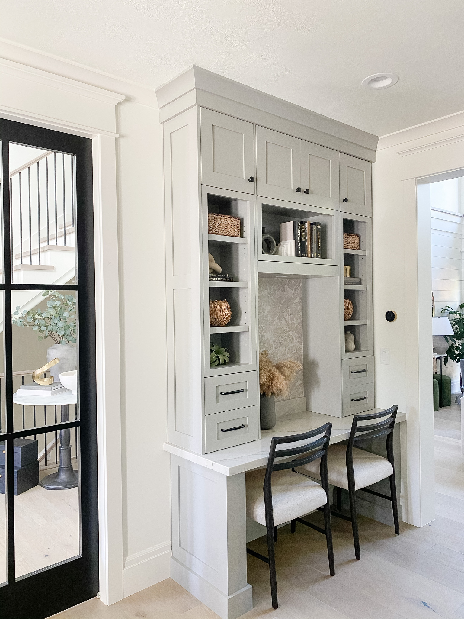
Our kitchen cabinets have a custom mix made by our cabinet maker that was created to compliment our floors. Unfortunately, I don’t have that formula. 
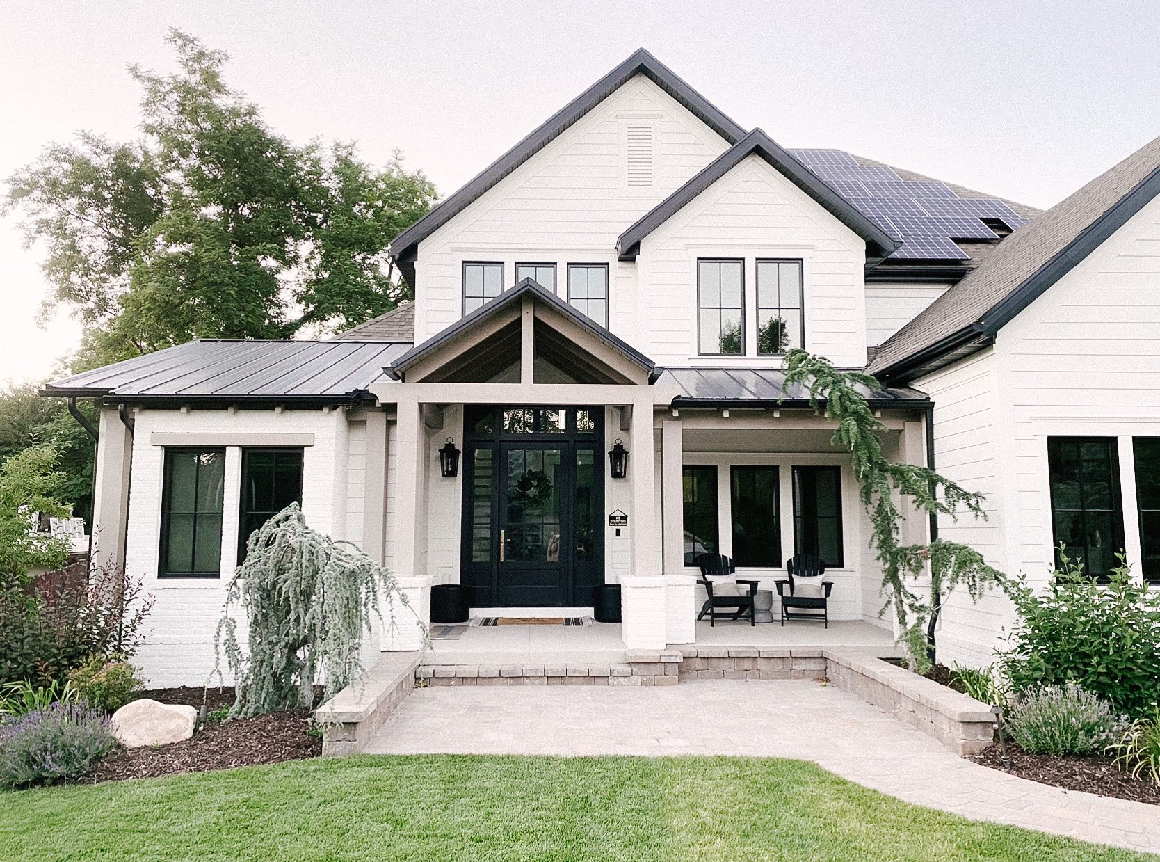
SHOP THE PHOTO

Exterior

We painted our entire exterior Benjamin Moore Simply White too. What can I say? It’s a versatile color. Our timbers and tongue and groove are painted a semi-solid stain to match Sherwin Williams Morris Room Grey – a warm, hearty color. It’s a great color to use on cabinets as well. 

The Best Neutral Paint Colors for Your Home

I think that covers most of our house! If you have any other paint color questions, please let me know. Happy to answer any questions.

Do you have a favorite paint color you use in your home? Let me know in the comments below! 


Kitchen

Modern Kitchen Cabinet and Island Design

Like many households, our kitchen is the heartbeat of our home. We love to cook and eat together as a family as often as we can. I’ve mentioned this before, but we lived in our house for 14 years before we did our home renovation. Because of this, we knew exactly what we needed to make the space more functional for our family. I’m sharing all the details of our modern kitchen cabinet and island design.

Modern Kitchen Cabinet and Island Design

How We Designed the Island

When we were in the beginning phases of designing our kitchen, we knew we needed more counter space, and create a better flow to the footprint of the kitchen. Our old island was oddly shaped, and it was contributing to the odd flow. Therefore, we removed the old island and installed a symmetrical, rectangular-shaped island. It’s 8.5 feet long by 5.5 feet wide. I also wanted to make sure the hood above our range was centered with the island and pendant lights. 

Modern Kitchen Cabinet and Island Design

SHOP THIS PHOTO 

The island countertop is Mont Blanc Quartzite. It’s two inches thick with a perimeter of 1.75 inches. The edges are mitered. I get asked often why we didn’t do a farmhouse sink. The undermount sink we chose was the same type of sink we had before the remodel, and we loved it! We had that sink for 14 years, and it didn’t have a stain or scratch on it. That’s why we chose a granite composite material from Blanco America. Stainless steel is too hard to keep clean, in my opinion, and scratches easily. We also love the tilted drawer feature the undermount sink allows for to store our sponges for cleaning dishes. 

Functional Island Storage

When I did a question and answer poll on my Instagram stories about our kitchen, a follower asked how much space is between our island and range. The space is about 45 inches of space. The area feels big enough to move around in, and small enough that you don’t feel like you’re hiking back and forth from the range to the sink. 

Modern Kitchen Cabinet and Island Design

Our recycling and trash bins are to the right of the sink. Because we wanted the entire island to look consistent, we put drawer fronts on the trash and recycling bins. Similarly, our dishwasher is to the left of our sink, and also has a cabinet front on it. We had a small amount of usable space available to use to the left of our dishwasher. Therefore, we decided to install drawers instead of a cabinet. They’re each 10 inches wide, and they’re such a functional use of space for storing things like dish towels, aluminum foil and storage bags.

Modern Kitchen Cabinet and Island Design

Brick Backsplash and Cabinet Colors

The kitchen cabinets have two tones to them. The first color we used was Benjamin Moore Simply White for all the white-toned cabinets. The second color we used, and the dark of the two is stained a custom color by our cabinet maker to match our wood floors. I wish I had the exact color because I get asked this quite often. Because of the contrast of the two tones, it helps break up the space, and gives it more depth and interest. 

The hardware for the cabinets are from Rejuvenation. I wanted the cabinets to all have a consistent look, so we chose six-inch pulls for each of them, regardless of the cabinet’s size. The refrigerator, tilt drawer and dishwasher have larger pulls with the same finish. I was hoping Rejuvenation would have the same style of pulls, but just in a larger size. Unfortunately, they didn’t though. I found some with the same finish as the smaller ones, and they work well. 

The backsplash is real brick that is cut thin. The bricks are about ½ inch thick, and they were applied the same way full-size bricks are laid. They’re beautiful and would do it again in a heartbeat. However, they’re hard to keep clean. If you splash grease or tomato sauce into the mortar, it’s hard to wipe it out because of the bumpy, rough texture. We discovered that quite quickly, and knew we needed to find a solution for the backsplash on the range. 

Modern Kitchen Cabinet and Island Design

SHOP THE PHOTO

Range Backsplash

We had a custom sheet of glass made to fit inside the range area to protect the brick from stains. The first piece of glass that was installed had this blue tint to it. It almost looked like a car windshield. One bit of advice is to ask for a low-iron concentration in the glass, if you want a very clear piece. 

If you want to know the details of our appliances and walk-in pantry, be sure to check out our kitchen renovation part two post! 

I hope this post is helpful, if you’re starting a kitchen remodel. It can be overwhelming at times to redo a kitchen. If you take little bits of information from a variety of sources, you’ll find the inspiration you need to create a functional and beautiful kitchen that best suits your family. 

What color cabinets do you prefer in a kitchen? Let me know in the comments below! And as always, let me know if you have any follow-up questions. 


This error message is only visible to WordPress admins
Error: There is no connected account for the user 17841404072974174.