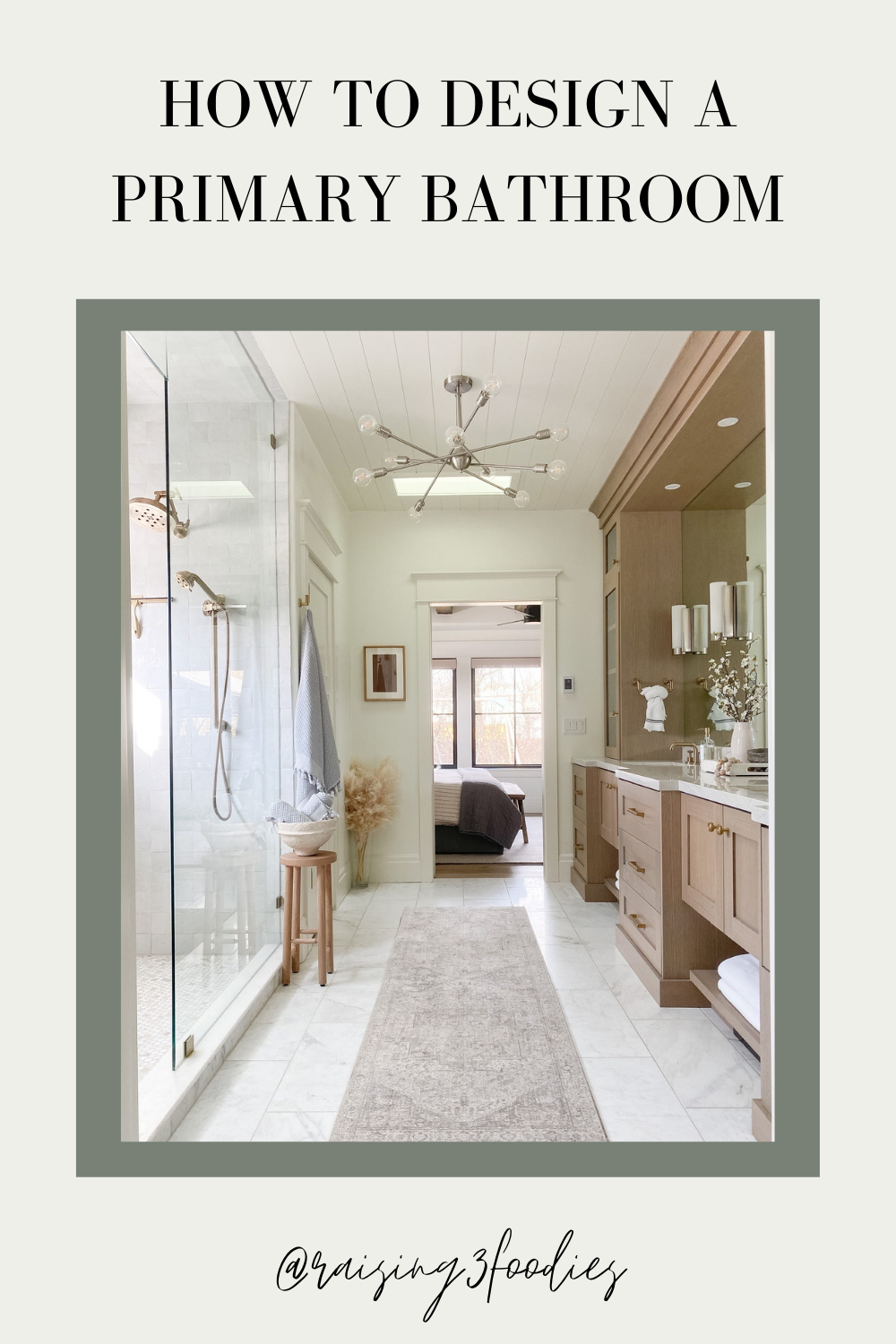
My vision for our primary bathroom was for it to be spa-like. At the end of a long day, it’s nice to have a place to unwind and relax. I continued my love of neutrals into the bathroom and incorporated texture and warm tones to make it feel welcoming. If you’re searching for tips on how to design a primary bathroom, I hope this post gives you lots of inspo.
For more design and decor info on the rest of our home, check out this part of the blog HERE.
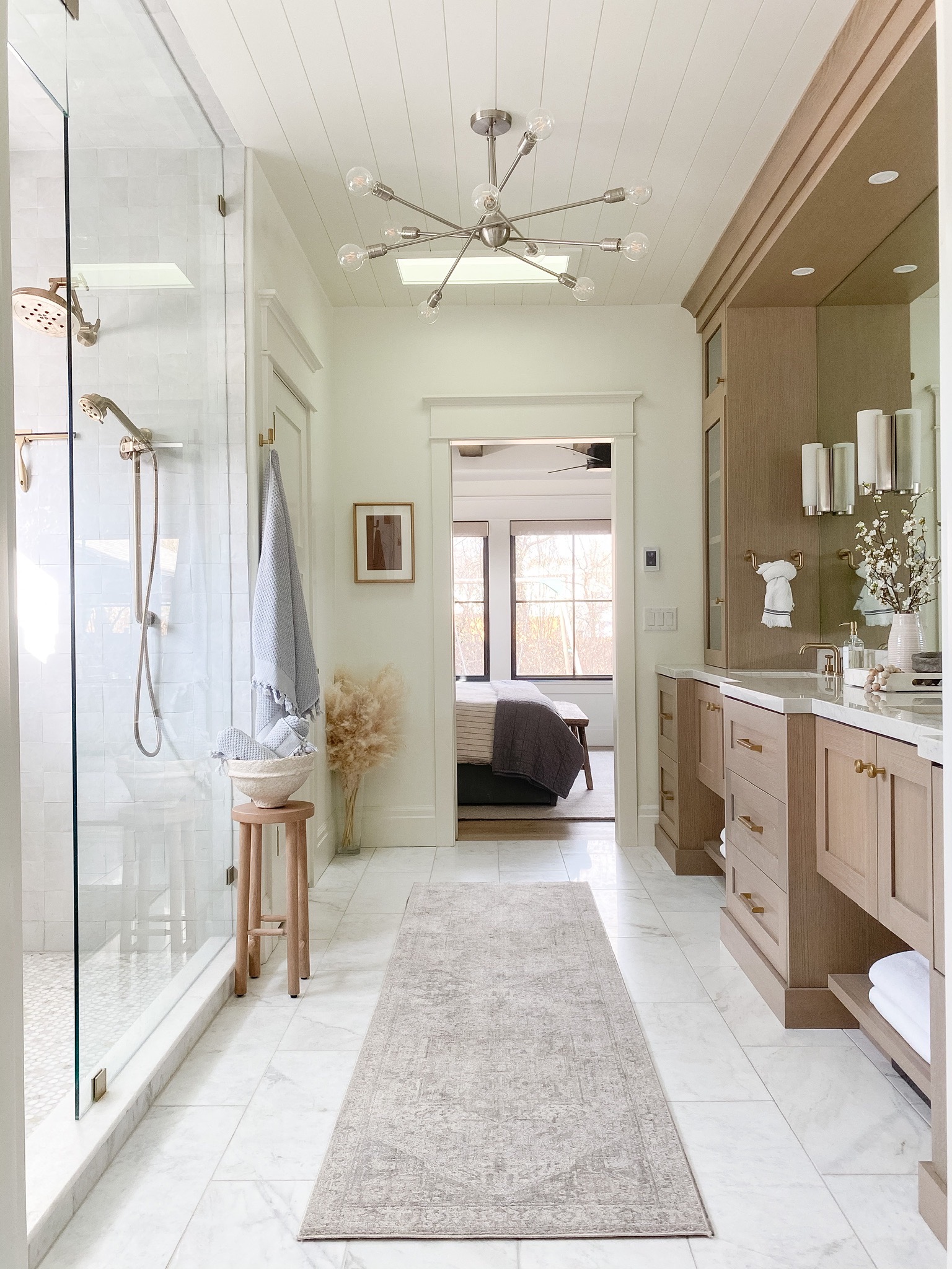
How to Design a Primary Bathroom
Shower Design
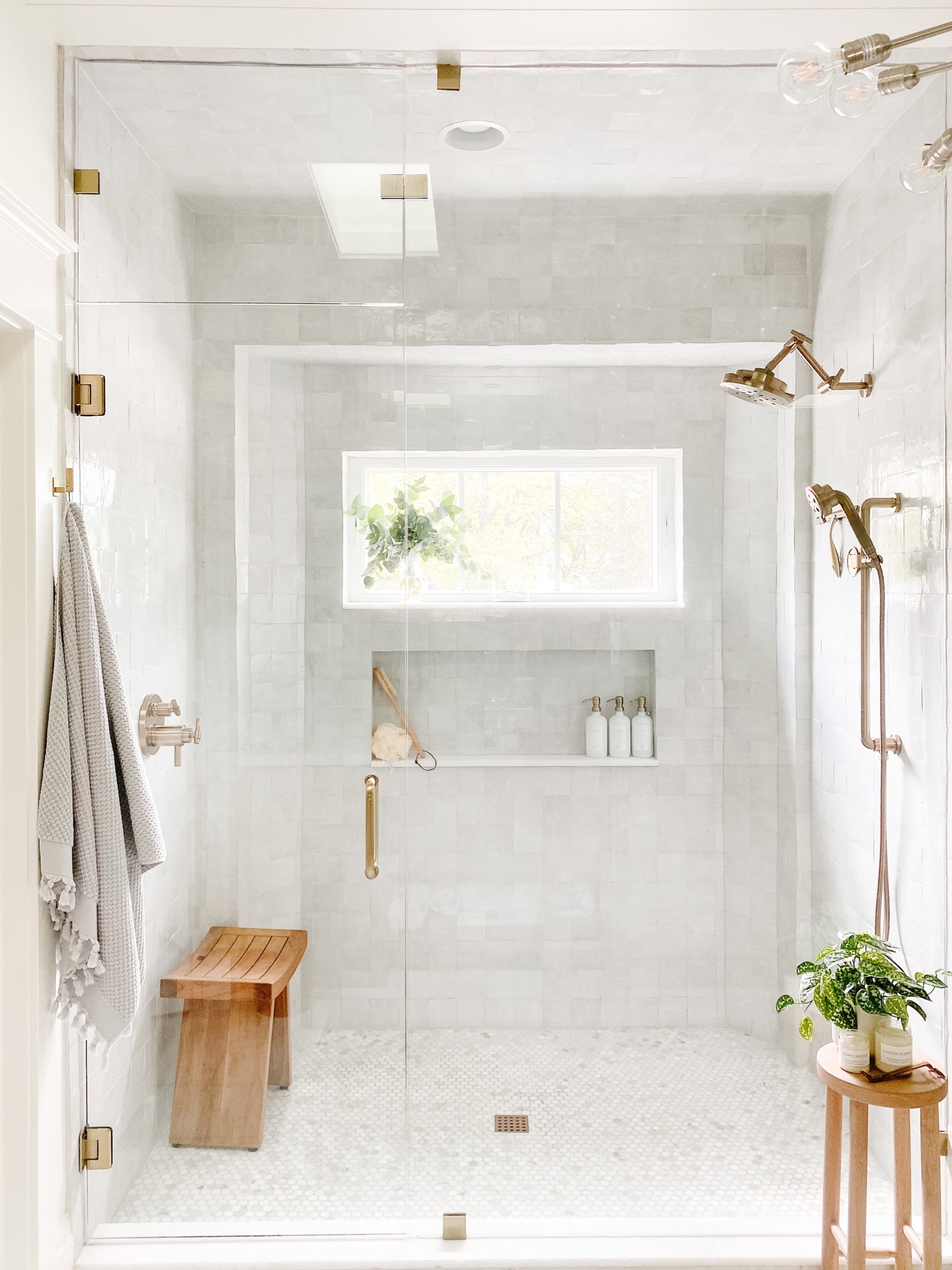
We opted to do a walk-in shower in our primary bathroom as opposed to including a tub too. I must say it feels like you’re at a high-end spa with a walk-in shower, and love how it turned out.
The tiles are the Zellige tiles from Zia Tile in the color ‘Pure White.’ This is a similar version HERE. The color variations in the tiles create a beautiful contrast throughout the shower. Then, we used UltraColor Plus FA in ‘Frost’ for the grout. You also want to make sure you get a good seal on your grout to help keep moisture out and the shower clean. See this Instagram reel for a closer look at the tiles.
I wanted the shower floor to flow well with the tile, but I still wanted it to be different. So, I opted for a hexagon tile with slight color variation just like the wall tile. I think it turned out exactly how I envisioned it.
For the shower fixtures, we used a brass tone throughout. They’re from the Brizo Litze collection. We included a combination of a shower head and a hand spray option. Having a hand spray option is amazing to have for cleaning the shower, too.
The glass enclosure was custom-made by a local glass company. They also made our glass piece that sits behind our kitchen range too. Read more about it HERE.
If you’re looking for a shower bench, I highly recommend this one. It’s not too big or small, and love the teak wood against the white shower.
If you’re intimidated by the thought of cleaning glass shower doors, I assure you they’re easy to clean! Watch this Instagram reel, and I’ll show you exactly how I do it using this cloth.
Shop Shower Details
Bathroom Floor Tile
To keep with the light and airy theme of the bathroom, we chose the 12″ x 24″ honed Daphne white marble. It’s from Daltile and the perfect blend of whites and grays.
Vanity Design
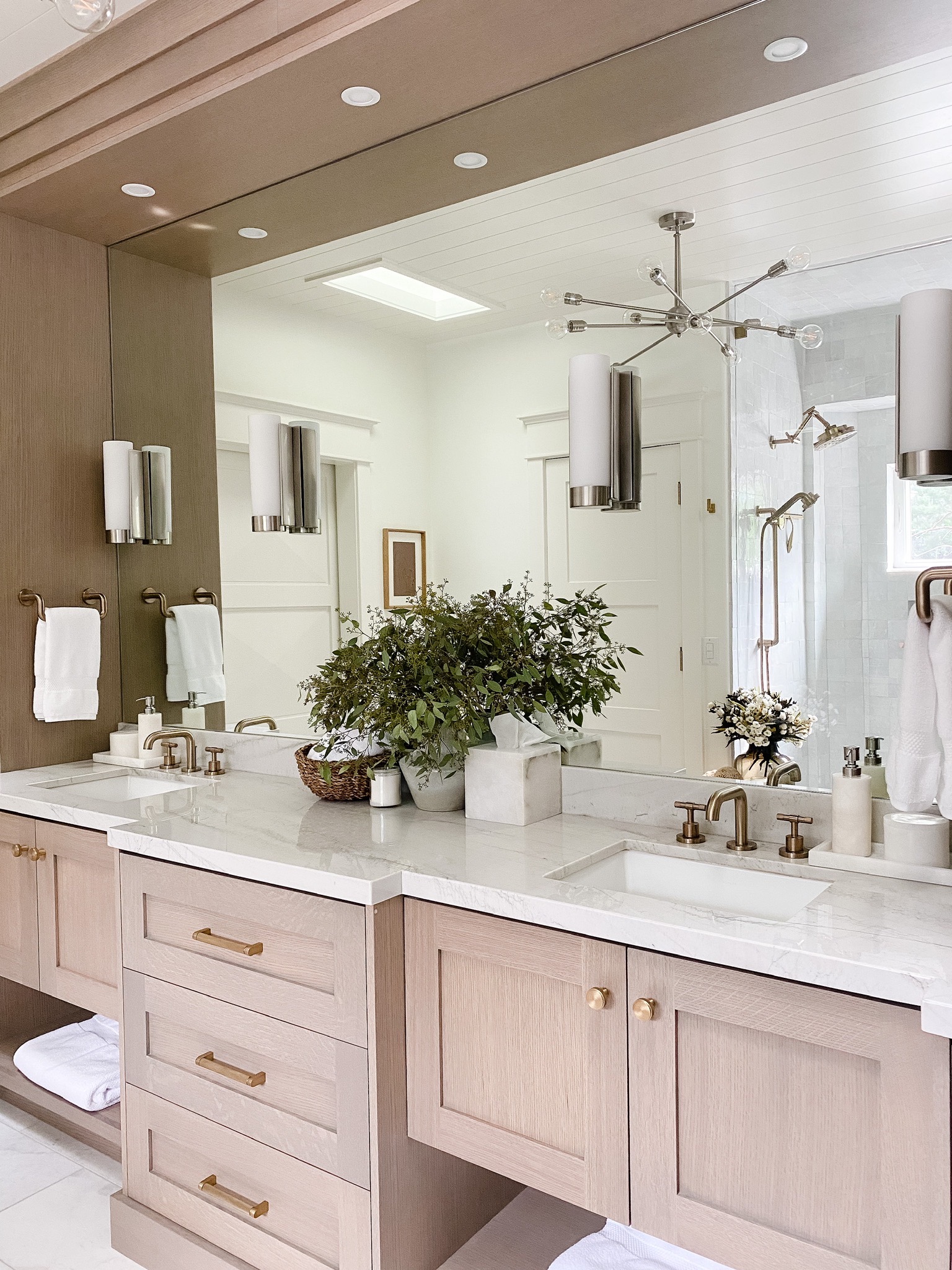
I warmed up the space a bit with the darker tone of the vanity. It’s made of white oak with a custom stain that was used throughout our house. The color was also used on some of our kitchen cabinets and areas of the house exterior.
Like the shower, we used brass fixtures for the sink and cabinet pulls. The sink fixtures are also from the Brizo Litze collection. The countertop is Mont Blanc Quartzite, similar to our kitchen island and butler’s pantry countertops.
Our knobs and pulls are both from RH. However, I found similar and budget-friendly options HERE and HERE.
Wall Color
The wall color is Simply White by Benjamin Moore. Most of the interior walls of my home are painted this color for good flow throughout the home. This includes all trim. However, we did use different sheens. I did a full blog post on all the paint colors used throughout our home found HERE.
- Flat: ceiling
- Eggshell: walls and trim
- Satin: doors and shiplap
Water Closet
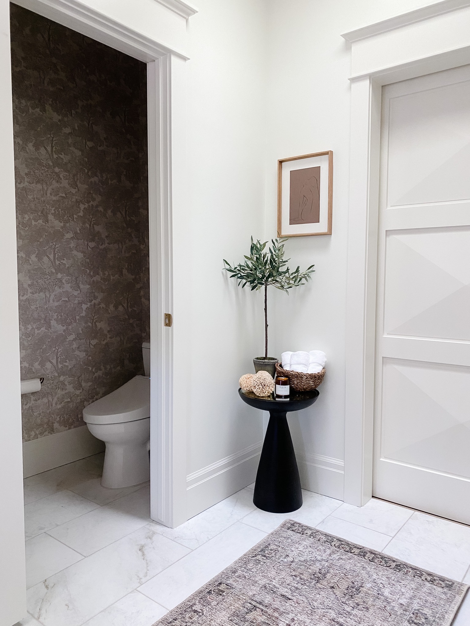
The last part of the bathroom is the water closet. Having a space just for the toilet is so nice, especially if you’re sharing a bathroom with someone else. I incorporated this gorgeous earthy wallpaper in this part of the bathroom, and I love how it turned out. We installed a Toto toilet and added this bidet!
Shop Water Closet Details
Mixing Metals in One Room
Do you love two different finishes of metals and can’t decide which one to use in a single space? Why not use both? You can totally mix metals in a space. In the primary bathroom, I mixed brass and satin nickel. I think it adds so much interest to a space versus just doing one. You’ll notice our light fixture on the mirror and the chandelier are satin nickel.
Some tips that I stick to are:
- Keep it to 2 metals per space.
- Be consistent with the finish on each item. For example, if you choose brass lighting, you should stick to brass for all the lighting in the room.
- Don’t stress if the shades of the metal aren’t exactly the same. The brass plumbing fixtures did not match perfectly with the cabinet hardware. However, since they are not right next to each other, you don’t even notice it. You only see brass!
If you have any questions or need additional details about this room, don’t hesitate to reach out via Instagram or leave me a comment below.
What’s one feature you’d want to include in a bathroom remodel? Let me know in the comments below!
Shop The Primary Bathroom
Pin this photo to save this post for later!


Your bathroom is giving me major inspiration – thank you! Would you mind sharing the source for your floor tile?
Hi Caitlin! The floor tile is by Daltile, and it’s the Daphne 12×24″ honed marble. Thanks for reading.
You said you did a custom stain on the vanity. My builder only uses a specific builder grade cabinets (so bummed) and I am trying to match the options to your vanity tone. Could you provide me any details on the stain? Are your cabinets oak? They are telling me I can only do maple. I would appreciate any help! Thanks so much!
Our vanities were custom and made with rift cut white oak. The cabinet maker mixed the stain to compliment our hardwood flooring. Thanks for your question!
I ordered a sample of the floor tile and it has some brown in it, but it’s hard to see that in yours. Maybe I just got a piece with a large bit of movement in it, but am curious if the brown is more visible to yours in person.
Hi Brooke,
Thanks so much for the comment. Yes, it does have some brown veining in it, but it compliments my cabinets perfectly. So I was pleased with how the tile turned out. I hope this helps. Thank you!